About project
We've found common interest
It wasn't just rebranding. Benedu language school had functioned in a big franchise network under a different name for 11 years. Finally the decision was made – it's high time they worked for themselves. Our task was to create the visual identification and the website that would present a rich offer of seven languages. Additionally, the program was addressed to four age groups and companies.
Client
Benedu language school is located in Pruszkowo. It offers English, Spanish, German, French, Italian, Russian and Polish (for foreigners) language courses.
Range of activities
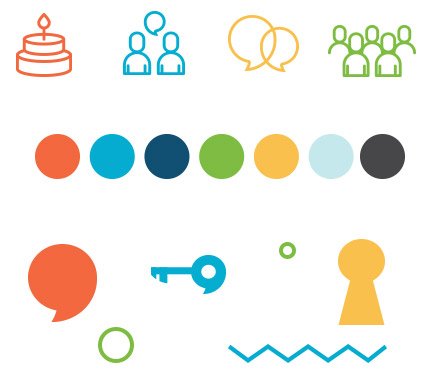
Logo
While designing the logo we've used certain elements like a speech bubble or a key. It's a symbol of opening the door to knowledge. Knowing foreign languages creates numerous opportunities for customers.
Identification elements
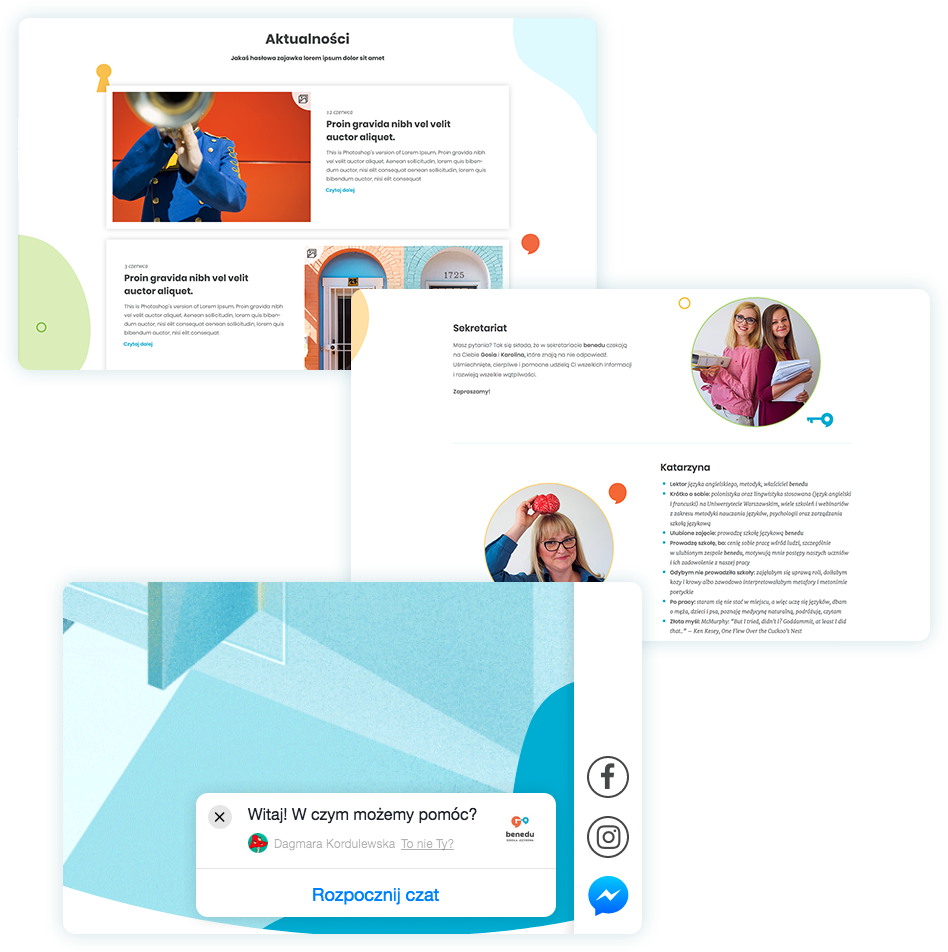
Some sections were exposed even better with the use of pictograms. The selection of colors was also intentional because the school educates mainly children and their families.
Illustration
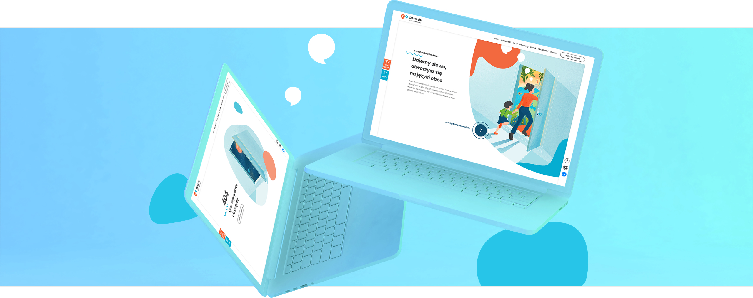
Thanks to the usage of animation instead of a regular graphics the website is dynamic and attracts viewers' attention. Our special illustrations are also a background for registration dialog boxes for each of the five customer categories.
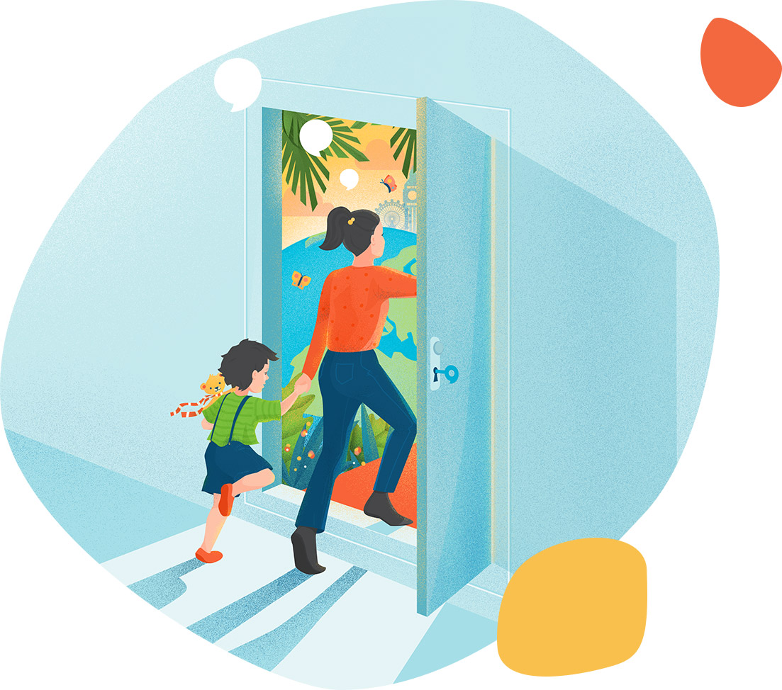

Illustrations refer directly to the brand's logo so the message is even more coherent.

Website elements
Team, courses, e-learning, price list, school news... - the page layout , despite numerous sections, enables one to find the most valid information quickly. Additionally, to contact the school just click a chat icon.