About project
Good business climate
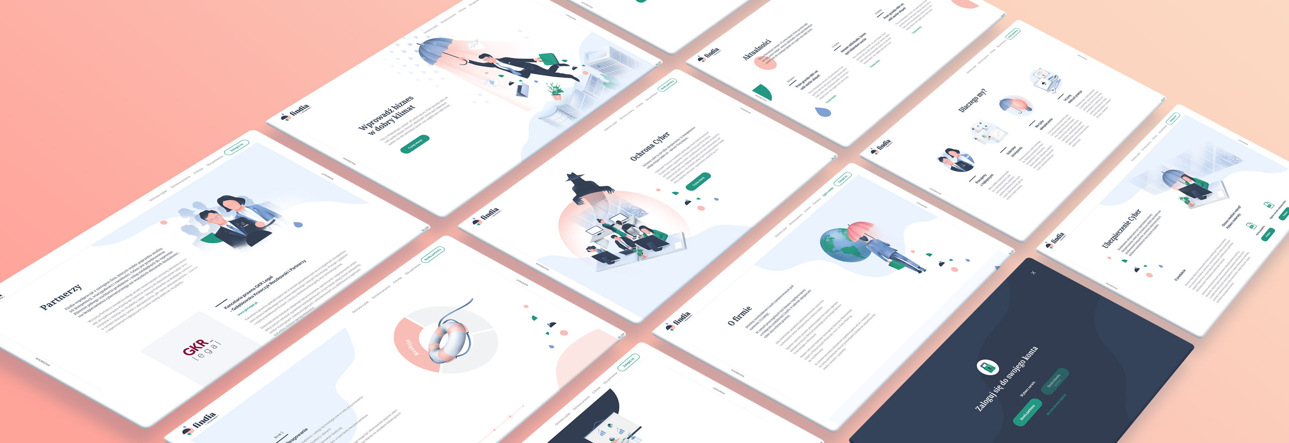
Findia specializes in cyber insurance and legal protection. To protect businessman against various dangers we’ve prepared a special set of advisory and insurance services. The brand cooperates with brokers and agents from all over Poland. Our task was to create a name for the new company, its visual identification and, most importantly, its website. The site had to function not only as a selling platform but also to educate about legal and IT security.
Client
Findia is a brand engaged in cyber insurance business. It is a Polish representative of Lloyd’s company – they has been functioning all over the world for more than 300 years.
Range of activities
Logo
The sign is a metaphorical symbol of the brand’s activity that protect the businessmen against various dangers and creates better opportunities for development. We’ve used a bunch of simple, geometric shapes – an umbrella for protection and rain for dangers.
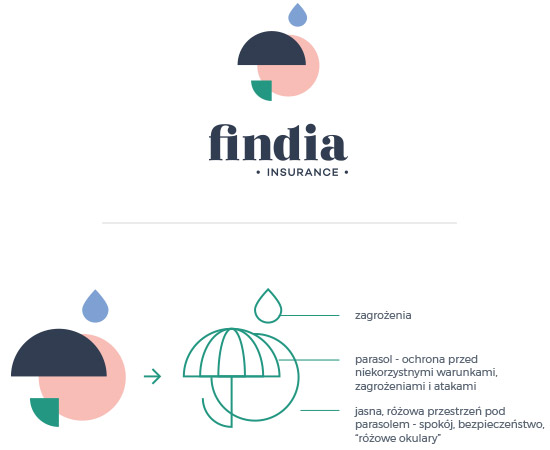
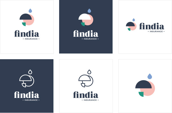
Sign in vertical and horizontal layout, contrast and monocolor.

Our creations present the brand’s offer in a relaxed way.
Implementing a solution and the project’s characteristics
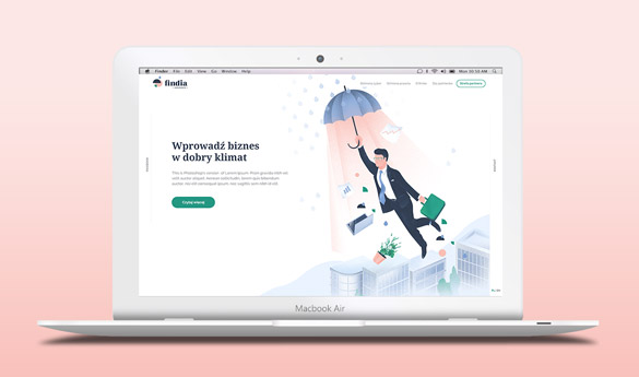
Full screen rolling
Instead of a classic way of scrolling a page we’ve offered slides that adjust to certain screen sizes. One move smoothly switches the whole thematic section.
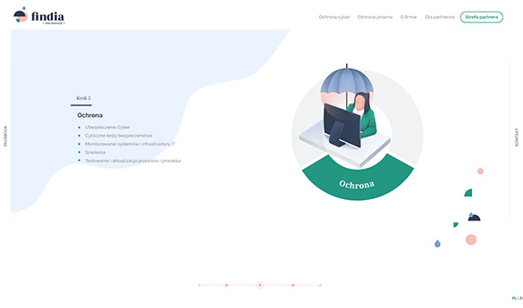
Graphs animation
When presenting the details of the offer we’ve used an animated graph consisting of vector elements. By scrolling it the section changed horizontally.
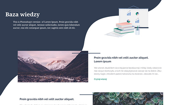
Knowledge base
We've designed a section with special articles bearing in mind the educational function of the site. In the knowledge base users can find professional advice concerning cyber security and insurance.
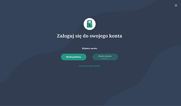
Partner zone
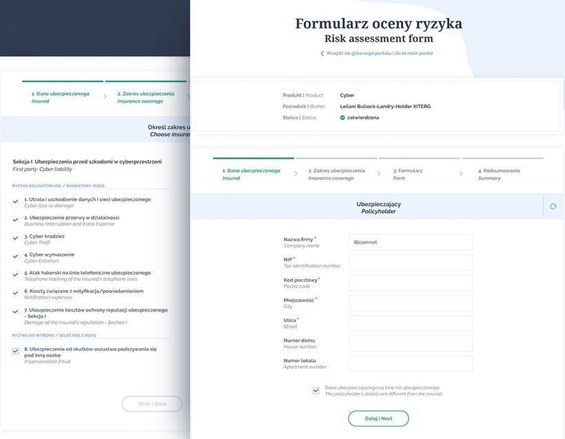
Companies can log into special accounts where they can find the most important information concerning their security system. The section was designed also while bearing in mind the brokers and agents cooperating with the company.
