About project
School in new colors
Creating a website for a language school is always quite a challenge. This is mainly due to a very extensive offer including several foreign languages addressed to different audiences. The situation was similar in the case of Language & Progress, which operates in Germany and underwent a significant rebranding. Our task was to design a completely new website which would stand out from other schools. Therefore, we proposed an illustrated website using only original creations. The whole visual identity also gained a new character.
Client
Language & Progress is a language school operating in Frankfurt. It offers Polish, English, Italian, Spanish, Chinese, Arabic, Japanese and of course German.
Range of activities
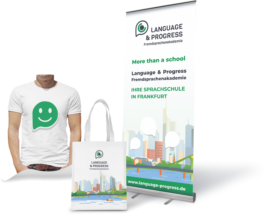
Logo
The logo consists of a signet and a logotype as well as a note with information about the brand activity. The signet represents a shape formed by a combination of a conversation bubble, an eye and a round charging symbol.
The logotype is the name of the school in majuscule, in a sans-serif font with characteristic rounded letters. We have also used the sans-serif pattern for the addition ”Fremdsprachenakademie”
Sign vertically and horizontally on a white background and in contrast
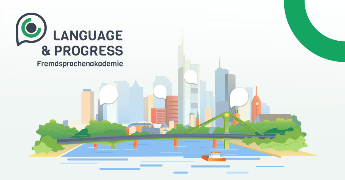
Illustrations
Site design is unique because of our distinctive illustrations. All creations were kept in the same style, thanks to which the site creates a coherent whole and better catches the eye of users.

In illustrations we used consistently the same color palette as in other elements of identification.
Graphics for language courses
For each language course we have prepared an illustration referring to a particular country. Apart from the commonly known object, we also used an element characteristic for a given culture. The graphics can be found not only in the main section with courses, but also - in a larger form - as the main images on individual subpages.
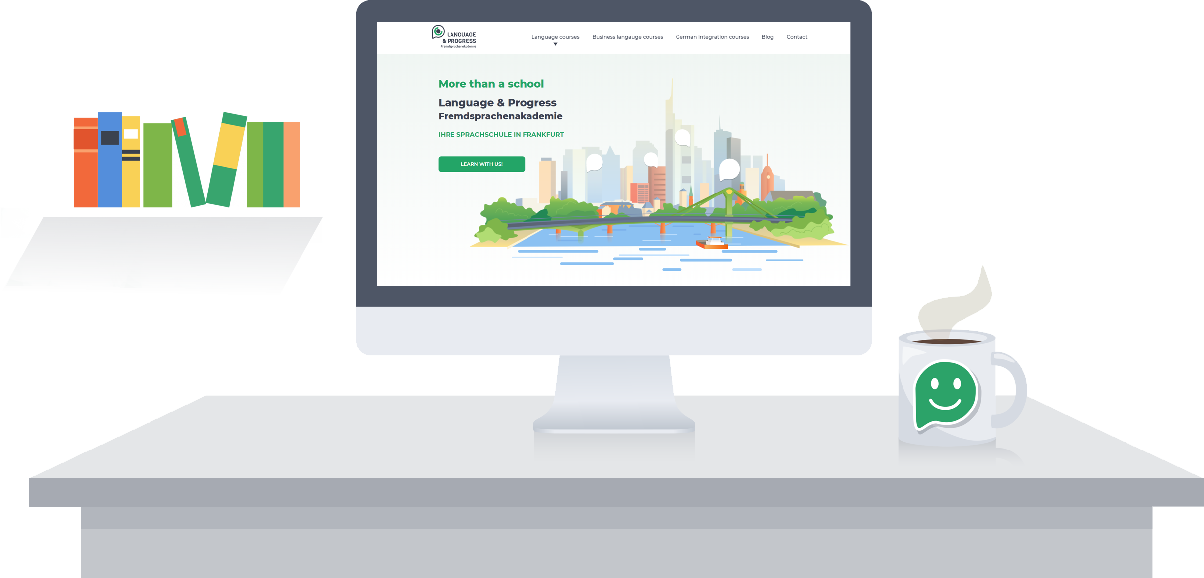
Responsiveness
Phone, tablet, small laptop - the new website is easily displayed on mobile devices. Despite the fact that the school's offer is quite extensive, the user will easily find the course he is interested in even on a screen with a smaller resolution.
Opinions of course participants
Applied solutions and project features
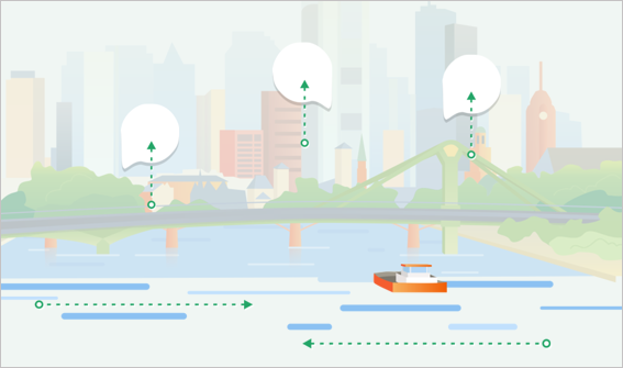
Animations on the website
Animation elements used on the homepage bring the site to life, but at the same time do not confuse the user.
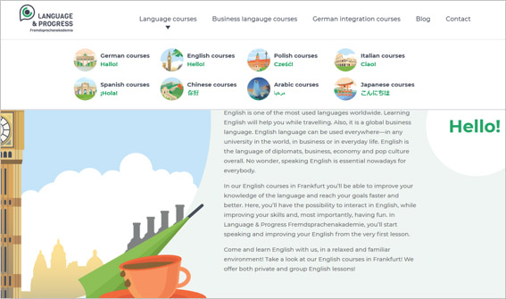
Image-based submenus
Expandable menu part was enriched with small graphics referring to particular countries.
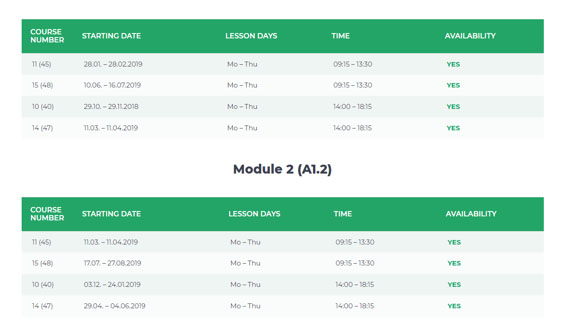
Clear offer
Each language has a separate subpage. Moreover, the list of courses has a form of tables, so despite a lot of information, all of it is clear.
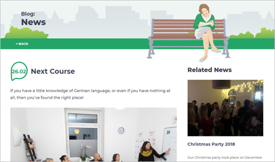
Blog
An important element of the website is a blog run by the school's employees. We have divided it into three categories: news, Frankfurt, and events.