About project
About project
In our school, there is no typical learning at the blackboard and memorizing words. We put emphasis on the living language for real communication. We do not teach in a standard way and we would like that to be visible on the website - emphasized Live employees from the very beginning.
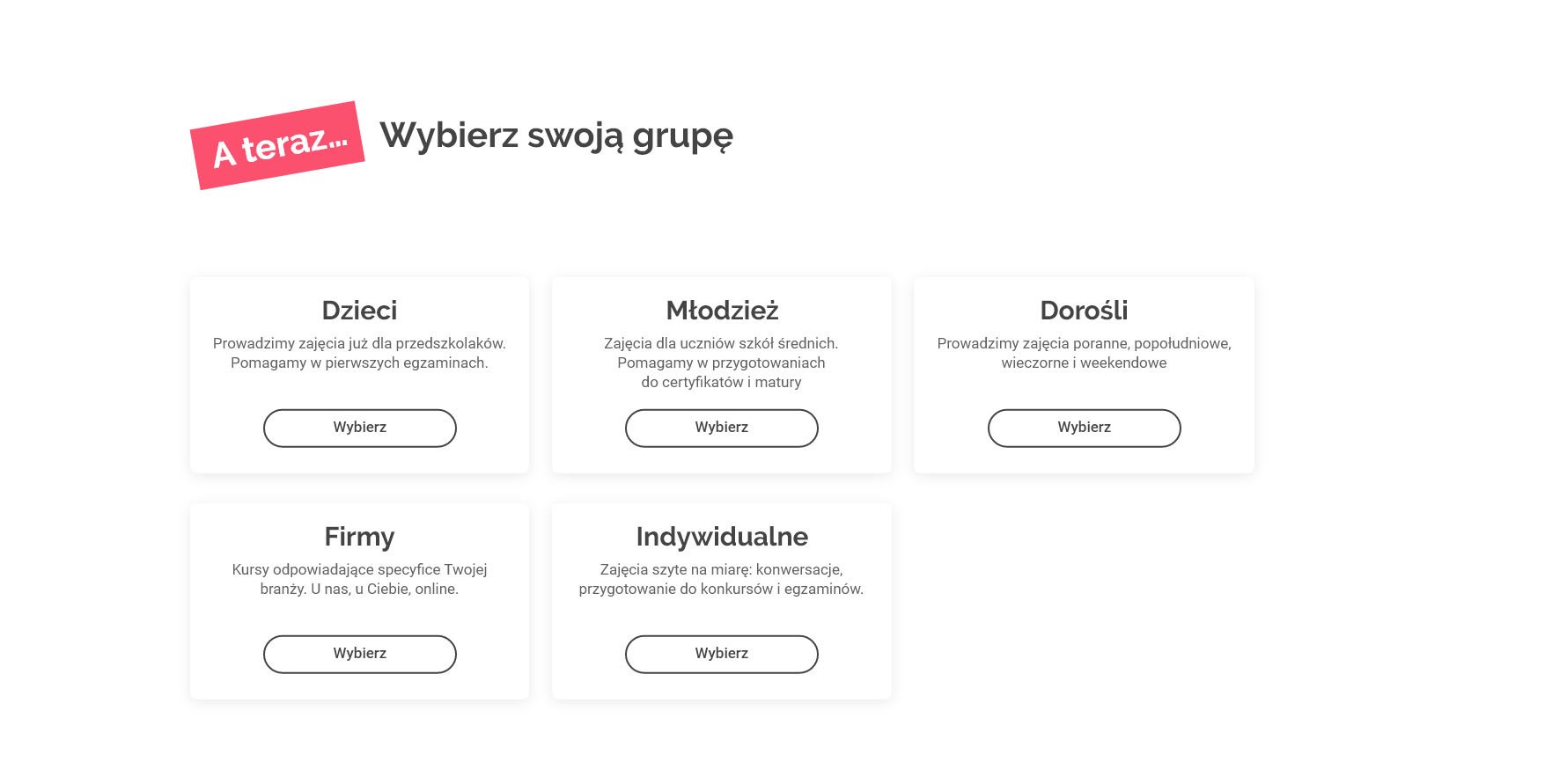
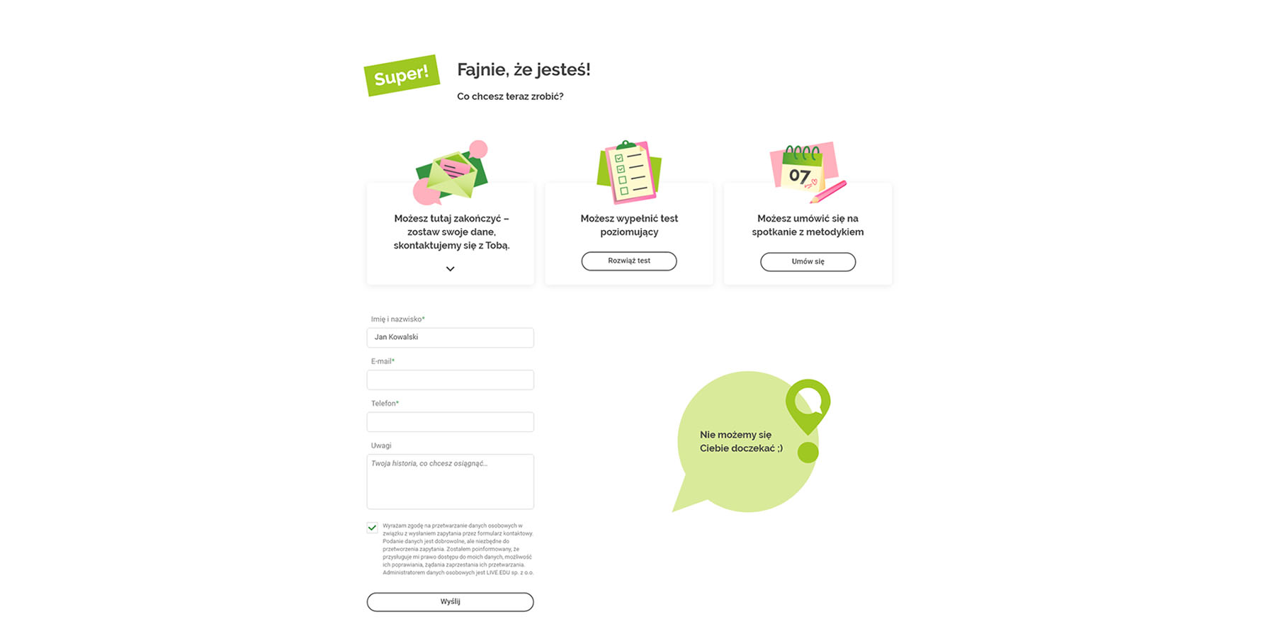
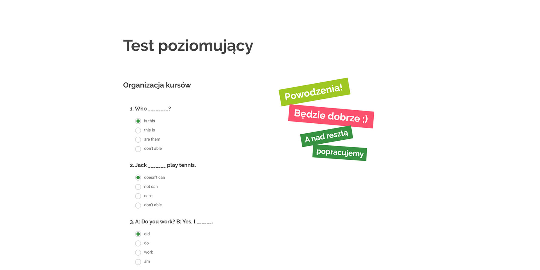
The website had to change its character significantly. Our task was to design a new visual identity, which would correspond to the active, cheerful, but also professional image of the brand. But of course, that was not all. The new website also had to make it easier to reach the most important information, such as enrolling in a course, making an appointment with a methodologist, or contacting us. Importantly, the website had to be equipped not only with an enrolment system and online test, but also be linked to an external educational management platform. How was our mission accomplished? See for yourself!
Client
Live is a foreign language school that has been operating on the Łódź market since 2001. The company teaches five languages and is an official preparation center for the Cambridge English exams.
Range of activities
Logo
Structure of the logo
The logo created by us consists of a logotype and a signet. The logotype is a record of the name in text letters, sans-serif typeface with gently rounded character ends. Signet represents exclamation mark with negative space in a shape of conversation bubble.
Sign versions
The logo can function both vertically and horizontally. Under special conditions, it is also possible to use only the signet ring. Furthermore, all versions of the logo can appear in full color or in monochromatic variants.
Website
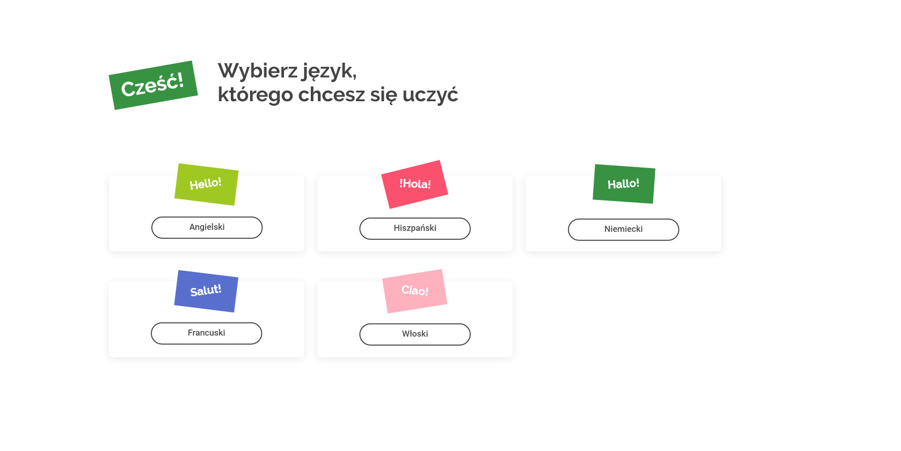
Original illustrations
The previous version of this page was based on stock photos. However, an original approach to learning requires original materials, so we designed original illustrations. The new graphics not only reflect the ”refreshing” character of the brand, but also show that learning languages can be a great adventure. The whole is complemented by real photos of the school.

Printing
Work on the website preceded the start of a new school year, so our task was also to create a promotional leaflet design. The brochure (DL folded) was later delivered to the citizens of Łódź.