About project
A new dimension of thermal imaging
SENSE Software is a software company which creates tools to improve thermal imaging inspections. Its modern programs help analyze thermal images and generate reports. Unfortunately, the brand image and its previous website did not fit well with this modernity. This had to be changed.
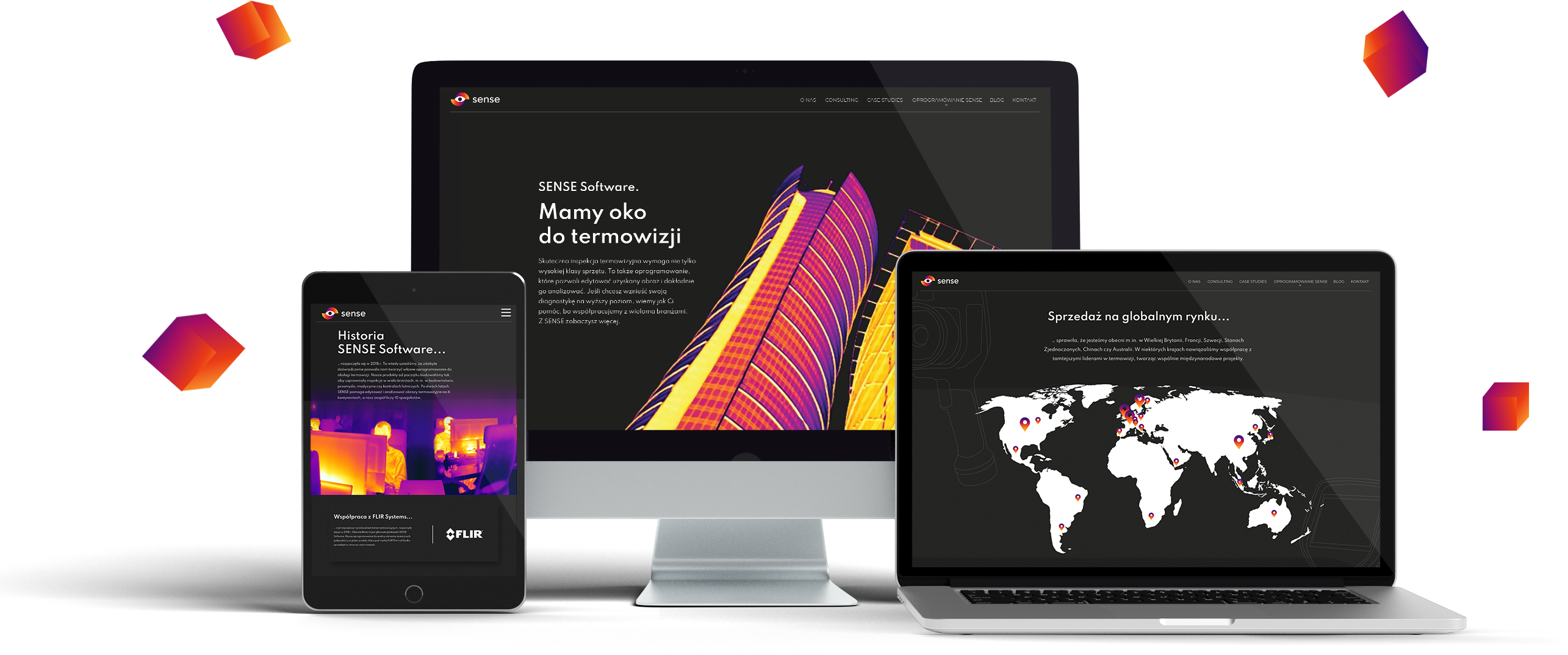
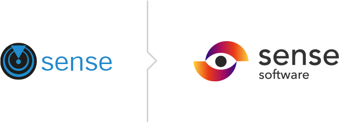
The first step was to create a new logo, the second to design the website. The new website was supposed to present a very technical offer in a more accessible way, combined among others with videos presenting specific functionalities. Another aim of the refreshed website was to present the company as an expert in the industry, which resulted, among others, in introducing the "About us" section. Although there were many more changes...
Client
SENSE Software is a developer of thermal imaging camera software. The company has been operating since 2018 and serves customers in the US, China, Russia, Australia, and the UK, among others.
Range of activities
Rebranding
The logo consists of a logotype and a sigil. The logotype is the writing of the brand name in text letters (sans-serif geometric typeface). The signet represents a stylized eye which is the so-called negative space resulting from the combination of two geometric, gradient forms. The eye symbolizes visuality, the camera; the forms around it refer loosely to the aperture in cameras. The color scheme refers to the colors known from thermal imaging.
Sign vertically on a white background and in contrast
Graphics
One of the ways to present the offer, were original icons. Thanks to a consistent system of signs, the user can quickly find the type of software that interests him most. Such a graphic form - characterized by a quick message - not only better organizes the offer but also simply enlivens the whole project.

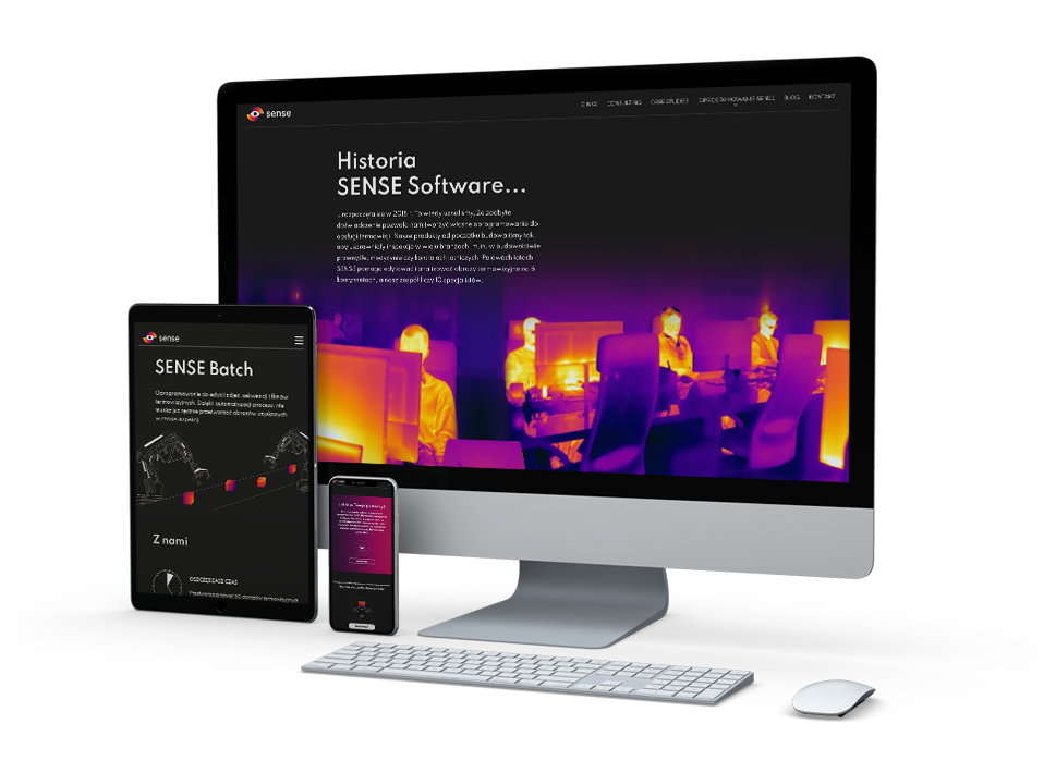
Responsiveness
The new website is, of course, adjusted to different resolutions, so that it can be used comfortably on a desktop computer as well as on a smartphone or tablet. RWD is already a standard promoted by Google. Websites designed in this technology are positioned higher.
Printing
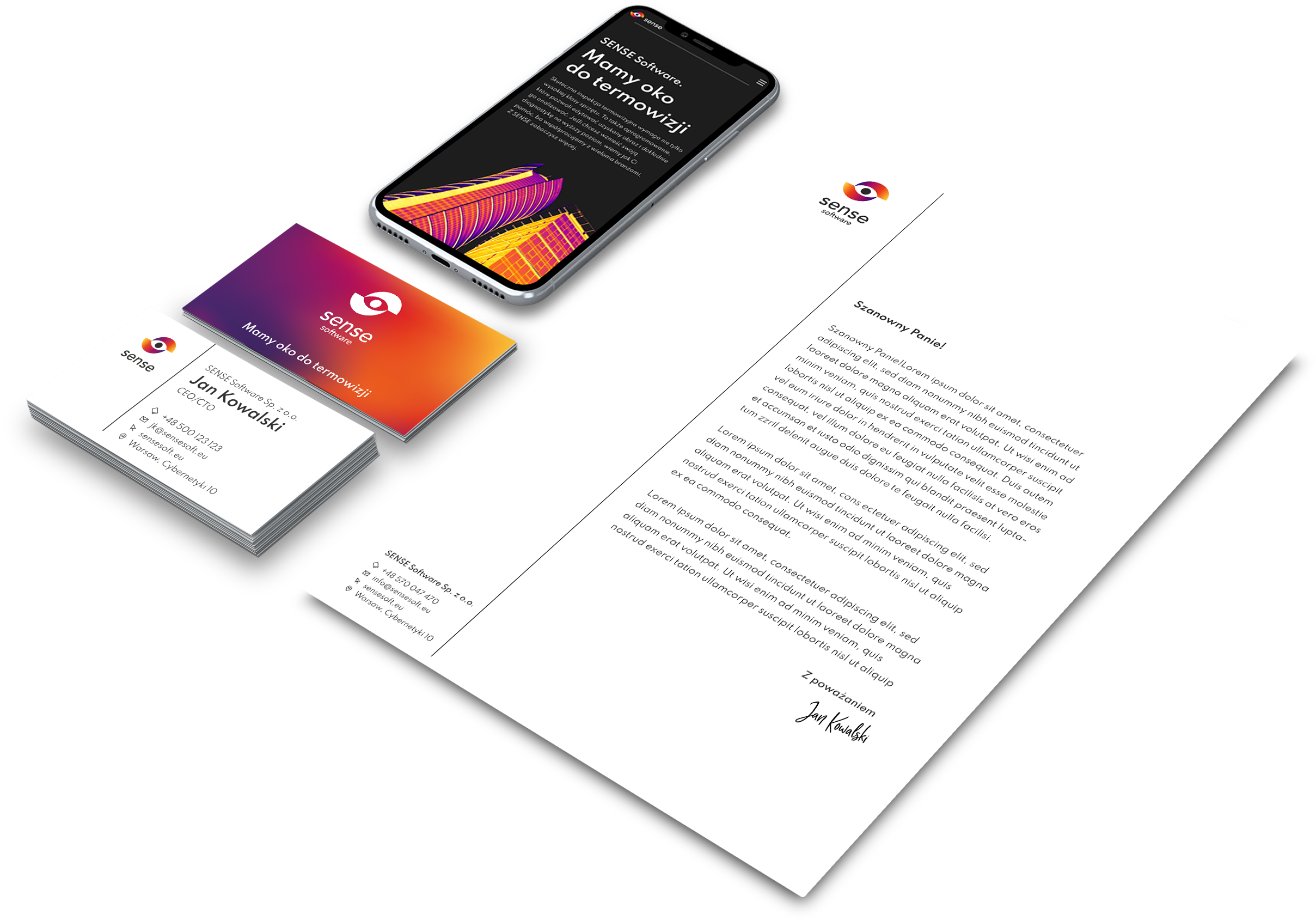
Our task was also to design other elements of visual identity: business cards, letterhead, and a template for the offer presentation. Thanks to that it is possible to build a consistent image on all levels of marketing communication.