About project
A new look for Socrates
Refreshing the image, making the message more coherent and highlighting the strengths of the school - these were the main needs of the owners of Socrates in the context of the new website.
The existing website was not fulfilling its role well for several reasons: there was too much complex content, a lot of information was unorganized, and the visual layer was based on typical stock photography. All this made the school lose in terms of image, although in reality it is very active (numerous programs, own publications, charity work, etc.). Our task, therefore, was to design a website that would not only make it easy to enroll in a course but would also finally allow the brand to stand out from the competition.
Client
Socrates is a language school that has been operating in the Warsaw district of Ursynów since 2002. It has the status of a Cambridge Preparation Centre and is actively involved in charity and pro-social activities.
Range of activities
Graphics for language courses
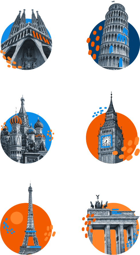
Graphics for language courses
The school offers six languages: English, German, Spanish, Italian, French and Russian. For each course we have prepared an illustration referring to the given country and its culture. You can therefore find Big Ben, the Brandenburg Gate, or the Leaning Tower of Pisa on the offer pages.
Applied solutions and project features
News
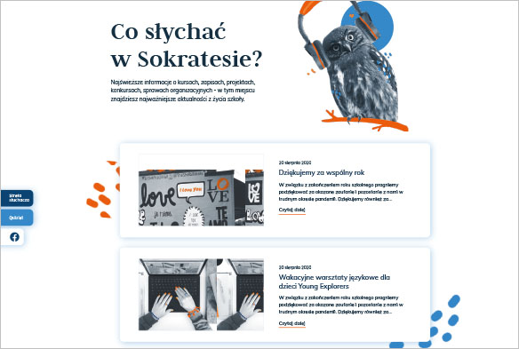
The content management system (CMS) allows the school staff to easily add news and make changes to the offer pages.
Materials to download
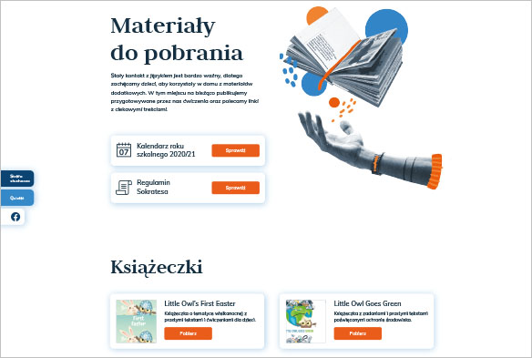
One of the school's distinctive features are its own language learning exercises. So, we created a separate section where students can download educational materials.
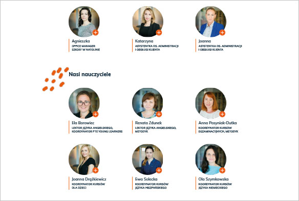
Team
Although the staff of Socrates consists of more than 30 people, we have introduced the whole team. In addition, next to each employee you can view a window with a brief profile of him/her.
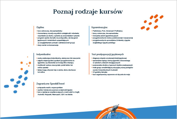
Offer
We have proposed a new, more consistent layout of information. Our texts are also much shorter than on the previous page.
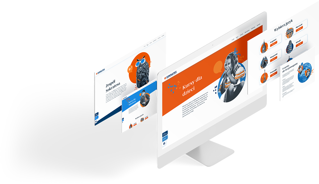
Original illustrations
Learning languages can be fun and this is reflected, among other things, in our characteristic illustrations. Importantly, we have used the same color elements in all of them.
