About project
From Teddy to Grizzly
Teddy is a language school aimed mainly at children and teenagers but also at adults who would like to improve their language skills. However, the brand image was not attractive and modern enough. The website, logo and promotional material could be more useful. While the process of rebranding we’ve paid great attention to these elements. The new sign is now coherent with the whole visual identification and the website is friendly and accessible. Now the customers can make themselves at home when visiting the website.
Client
Teddy language school was established in 2009. It offers English, German and French language courses.
Range of activities
Rebranding
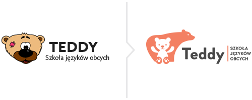
Rebranding
Changing the brand’s image was significant but we preserved a bear as a recognizable symbol of the school. The new logo is more coherent with the slogan and refers to protectiveness. It helped us to solve the problem of the symbol being similar to the one promoting a popular method of teaching English used in different language schools.

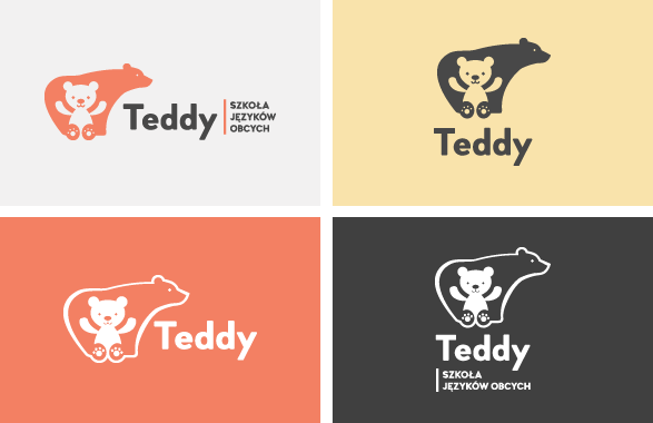
Sygnet
- the sign presents a small Teddy bear placed inside the shape of a big bear
Grizzly
- it symbolizes a teacher, mentor watching over small Teddy
- it also symbolizes Teddy’s goal referring to “From Teddy to Grizzly” slogan
Teddy
- a bear being given proper care develops, goes higher and his paws are raised as a gesture of victory and greeting
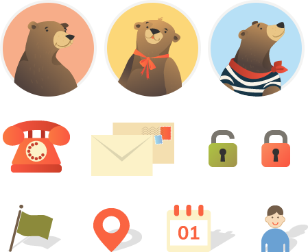
Special illustrations
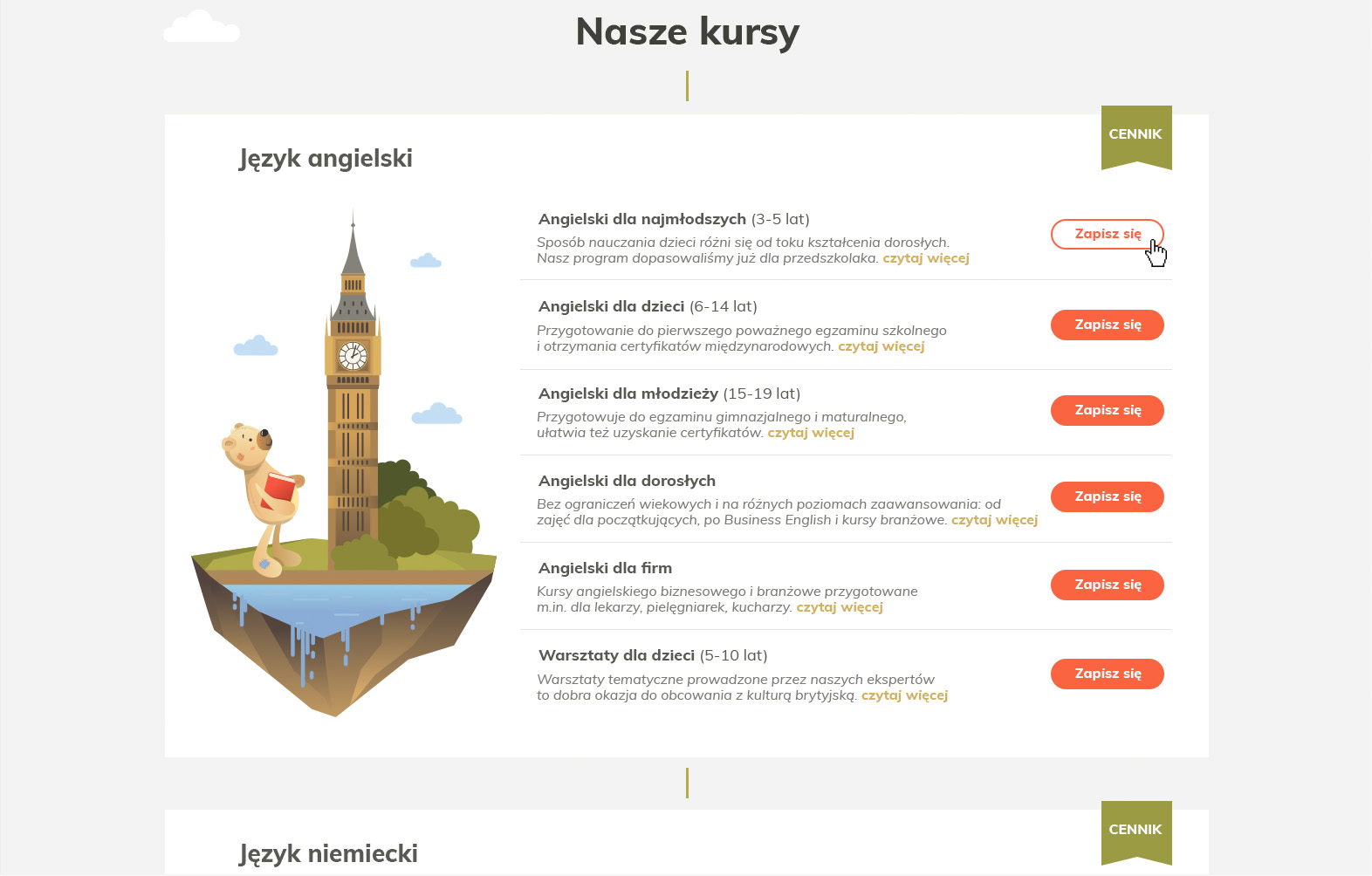
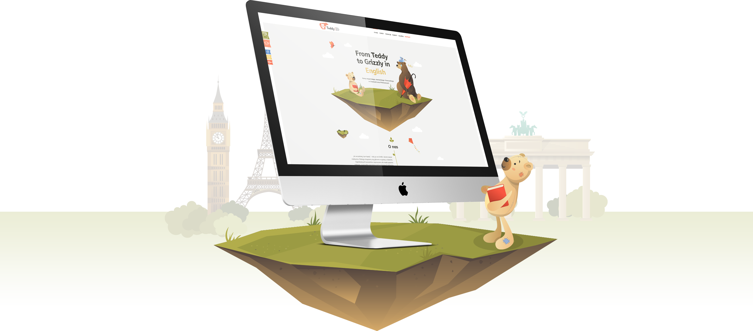
The brand hero and all the illustrations of characters and buildings are our special graphics symbolizing a given country and language. At the same time the website style clearly informs visitors that it specializes mainly in working with children. Thanks to vector graphics the content is more useful and exhibits full scalability.
Website
Website
Future students use the website to find the right course, contact details or address and they want it to be quick and simple. Thanks to our pictograms the most valid information is even more visible.
Responsiveness
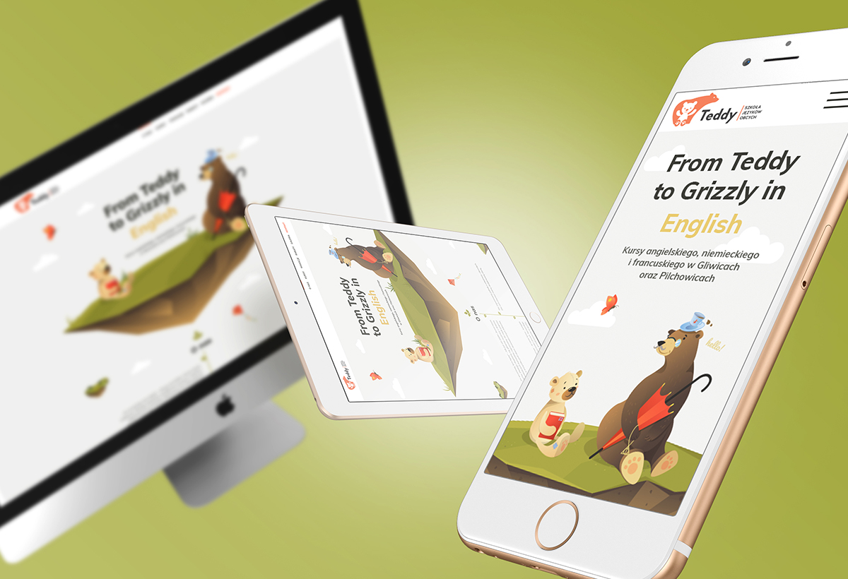
You can use the website not only on your computer but also on your smartphone or tablet computer. The website adjusts automatically to mobile devises’ resolution.
Used solutions
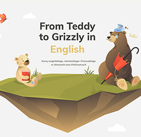
Animations
We’ve used the so called parallax effect thanks to which some elements on the website moves when the page is scrolled up and down. Some content is also presented in the form of a timeline.
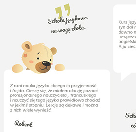
Customers’ opinions
The school’s reputation is based on students’ opinions so we’ve included them in the new version of the website. They will be extremely useful while deciding what class to choose.
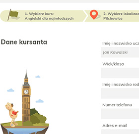
Easy sign up system
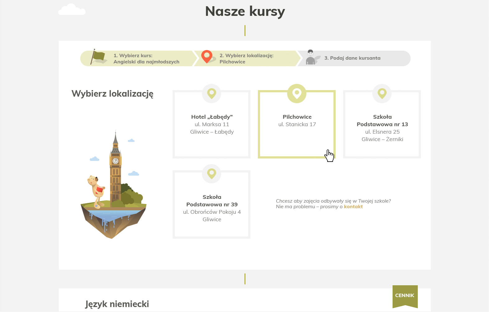
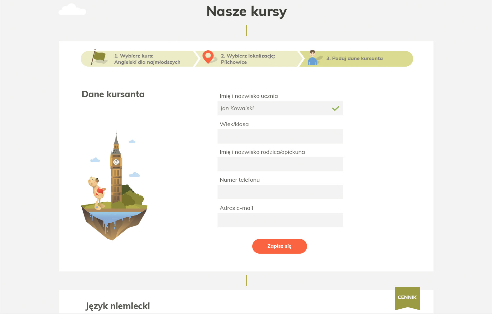
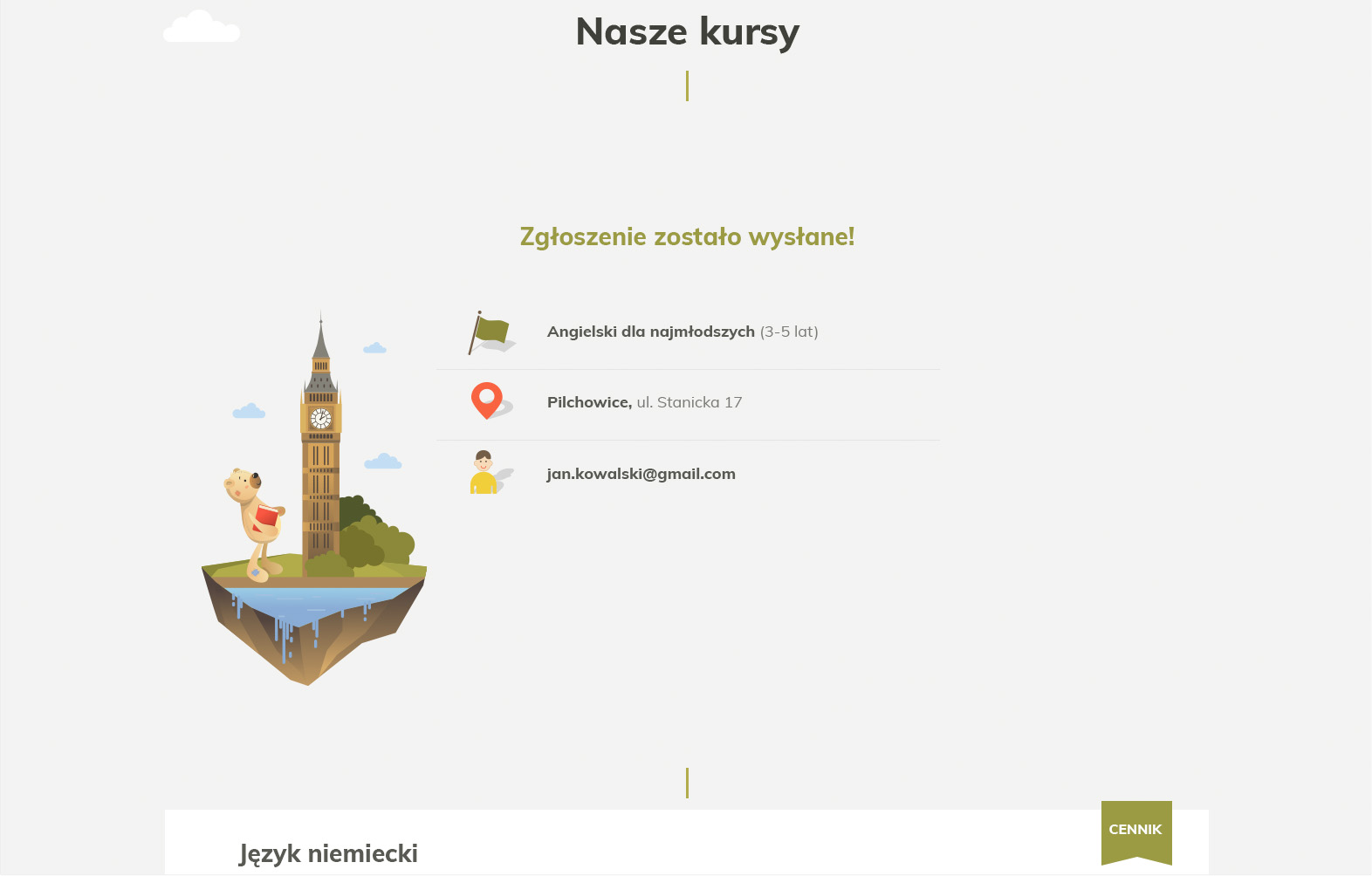
Now finding the right offer and signing up for a course will take you only a few clicks.
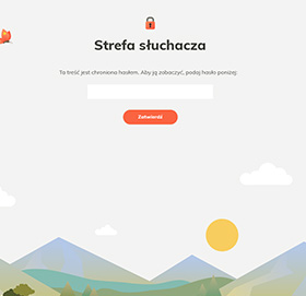
Listener zone
We’ve rebuilt the listener zone when changing the layout of the website and now the content is visible and clear.
Printing
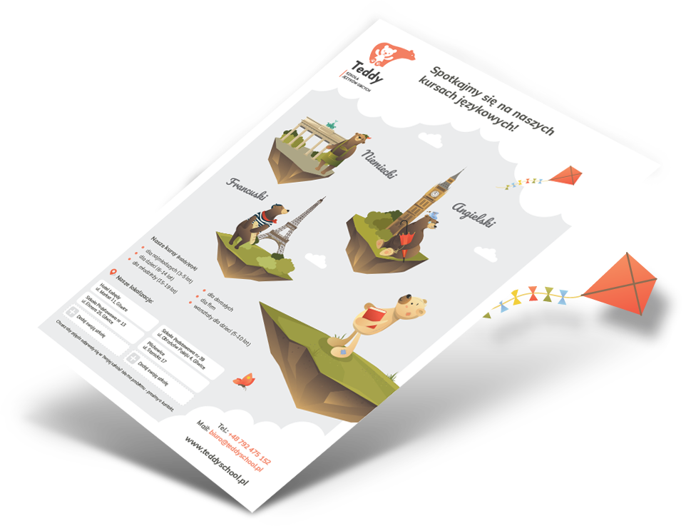
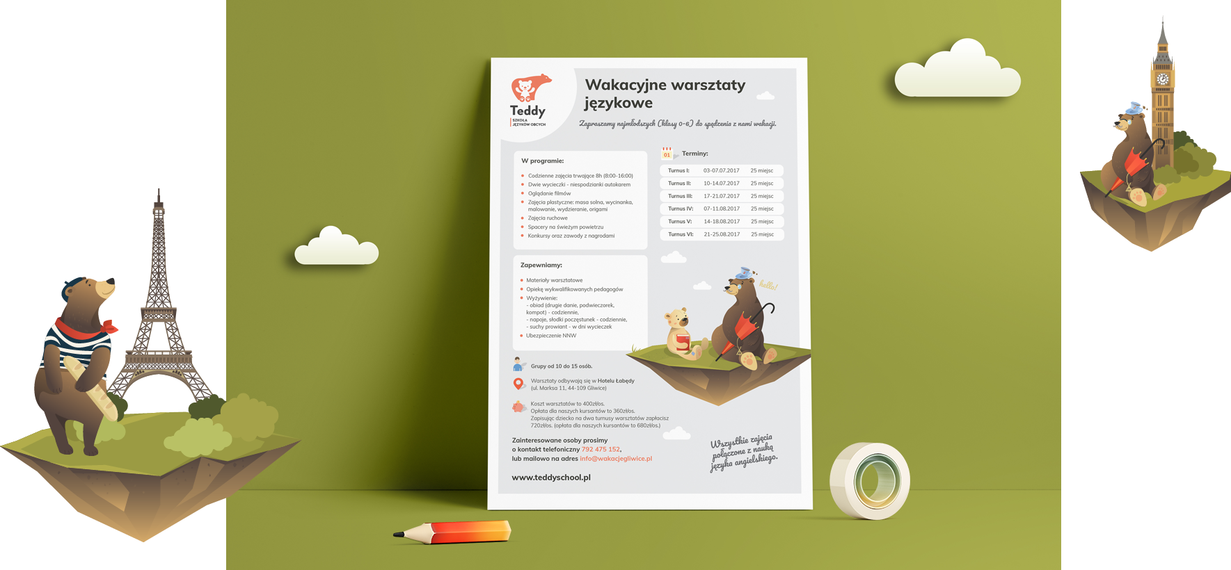
The Internet is not the only place to find potential clients so we’ve designed a special line of printing material for advertising. We’ve prepared posters, leaflets, billboards and stickers. The design both catches the customer’s attention and presents the school’s offer.
