About project
School and culture center
WSJJ is more than a language school. Its activities do not end with the organization of courses, but also include a wide range of cultural activities, such as cooperation with the Embassy of Japan, a summer school in the Land of the Cherry Blossom, publishing original textbooks and conducting workshops in calligraphy or drumming.
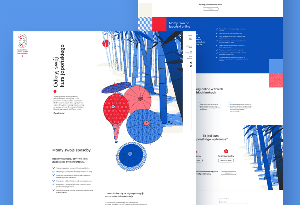
Therefore, our task was not only to attractively present the school, which offers Japanese courses from A1 to C2. In addition to the educational offer, it was also important to show the school as a kind of cultural center. The impulse for rebranding was the school's 10th birthday (happy birthday!) and the need to better adapt the brand to pandemic restrictions.
Client
Warsaw School of Japanese Language was established in 2011. Since its inception, more than 1400 people have taken part in its courses.
Range of activities

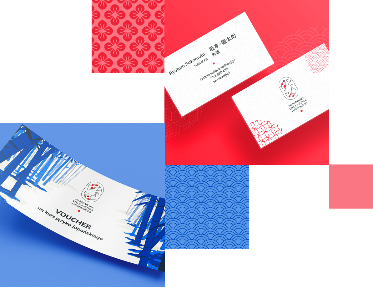
Brand logo
The new WSJJ brand is based on a design with a signet and logotype. The logo combines Japanese (koi carp) and Warsaw (mermaid) symbols and is inscribed in the form of a woodcut stamp. However, we made sure to always keep the Japanese minimalism. We opted for a more illustrative character, because - as the client expected - the signet was to appear often on its own on promotional materials.

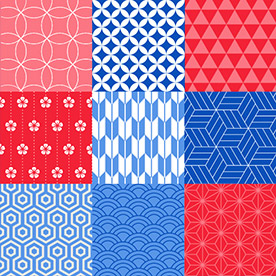
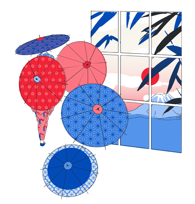
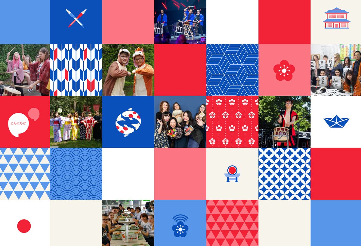
Japanese
patternsThe school's new visual identity is based on textures, mosaics, and patchworks, among other things. While designing it, we were inspired by popular Japanese patterns, motifs and even fabrics.
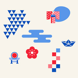
Symbolism of the Land of Cherry Blossom
In the project we used a set of simplified symbols. Some of them acted as graphic additions, but there were also some that had a specific task - for example, sakura, or cherry blossom, was used on the page as an icon by the types of courses.
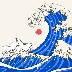
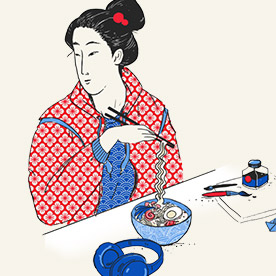
Illustrations inspired by ukiyo-e
Ukiyo-e, known as ”paintings of the flowing world”, is one of Japan's most iconic art types. Since the new site was meant to be illustrated, we were eager to draw from this... trend, as you can see from the many creations.
Tradition and modernity
The identity was supposed to be aimed at young people and adults, but at the same time it had to avoid being too literal. So, we mixed tradition with modernity. We show traditional characters with more contemporary elements, we combine higher culture with pop culture.
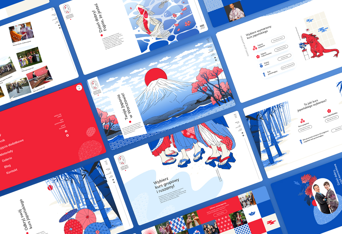
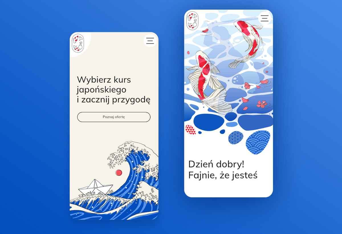
Identification system
Visual identification system is a broadly understood aesthetic that talks about the brand both on the Internet and on traditional materials. The website, printing, graphics for mailings... - all our projects are coherent, thanks to which we managed to maintain the original character of the brand.
”Not so scary Japanese :)” The hero of the new website is Godzilla, one of the icons of Japanese pop culture.

School gallery
The previous version of the website had a very extensive photo gallery, which made browsing and finding accounts not easy. So we went a different route - on the new site we posted a dozen or so sample photos, while referring users to full galleries on social media.
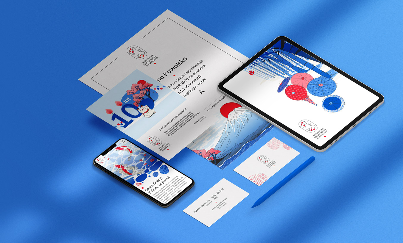
Printing
Although the main medium for brands today is the Internet, printed materials still remain an important part of the identity system. Rebranding of WSJJ therefore also included letterhead, business cards, diplomas and vouchers.